ABOUT ME PROJECTS
My Role

Redesign of CDN's webpage was a project in my design team when I interned in the Alibaba Cloud. I assited the UX researcher Yelai to conduct user research. Then we interaction designers decided that each person made a proposal(wireframe) to get more ideas. I finished my design indepentently and some part of my design was absorbed to the final version. Later, I refined my wireframe to the hi-fi mock-up and made a prototype.

Duration

2016. 06 - 2016. 07

Methods and Tools

User interview, Competitive Analysis, Information Architecture, Wireframing, Prototying
Xmind, Sketch, Principle

Introducion

CDN (cloud delivery network) is a service provided by Alibaba Cloud. Although this product has a big name (Yep, Alibaba Cloud is the No.1 cloud computing company in China), the CDN team kept worrying about its sales. It didn't mean it was not competitive in the market, but "it could have been sold more" (one of the team members said). According to records in our backstage, viewers of these pages seldom make decision to buy our product directly. Thus we had a assumption that the current webpage didn't take the role of advertisement and promotion as it was supposed to. So the redesign project began.

RESEARCH: define the problem

As we needed to verify our assumption, we planned to listen to our users' opinions at first. From communications with our users, we looked forward to finding what we didn't do well. And then I conducted competitive analysis to see what our competitors did well.

User Research

Firstly, I got a list of our customers from the back end and made a lot of cold calls. In these telephone interviews, I mainly ask their use case (for company or for personal use), their reasons of chosing our service, and their problems when they use our products. And I invited them to participate our onsite interview. Finally, five customers accept my invitation.
As for the onsite interviews, I assited Yelai to dig more deeply about our users' behaviors, habits and opinions.

After interviews, I found that our customers can be classified to two categories: Expert and Novice. And the information they want to find on our website is completely different:

Expert
Expert users are quite familiar with technic, our products and how to use them. For them, the website is like a transfer station and their destinations are dashboard and technical documentations. Usually, they don't spend much time viewing the website, but they would like to pay attention to the feature updates.

Novice
As for "Novice", they would like to know more about the product by viewing the webpage. So, introducing our product in a simple and clear way is every important. And they are sensitive to the price as most of them buying for personal use.

Competitive Analysis

I. Choosing competitive products.

Since Alibaba has been developing both domestic and foreign business, I decided to learn from competitors in China and abroad. So I chose Tecent Cloud(Alibaba's main competitor), Microsoft Azure (foreign big name), Xingyu CDN (a domestic small company, interviewees mentioned), and fastly (a foreign small company, interviewees mentioned)

II. Comparing them from aspects of call of actions, layout and contents in their landing pages.

Call of actions
It revealed that the actions on our webpages is the most complicated. And “starting to use” was not the main action.

Layout
Alibaba Cloud is the only website which doesn’t have responsive design.

Contents (ordered by importance)
We lacked the recommendations for purchase and We don’t have a part introducing price.

Refine the Problems

Therefore, through user research and analysis, I refined that the current website has four main problems

I. Poor readability
There are too many words and the important information isn't highlighted. Too much information without hierarchy almost equals no information, because usually users don't have too much patience to read a lot of text in a website

II. Lack price related information
For "Novice Users", price and budget is very important

III. Lack product log
For "Expert Users", they care about the version updated and new features, but currently this information can be easily ignored in this webpage.

IV. No responsive design

Design: solve the problems

According to the research, I realized need to re-organized the content and structure of this website. Basically, I planned to cut off some not-so-important contents and improve the readability by using more images and less words. And I also kept in mind the needs of our two types of users.

Information Archietecture

I reorganized all contents in the landing page, and made an information architecture. The tags on the picture indicates where I made main changes. And the changes are listed below.

Optimization

I. Improve the readability
1. In the part of introducing advantages, there are too many words which can’t highlight the key points before redesign. So I cut off some words and use more images to attract viewers’ attention.

2. I redesigned the form for showing scenarios, improving the readability and adding recommendations for purchase.

3. I used background images in the part introducing customers’ use cases, making them more conspicuous.

II.Price section
I added the price part in the form of a calculation. So the users can estimate their budget

III.Product log section
I made the version updates information a whole new section to record all the history of features updates so users can easily track their product's version.

IV. Responsive design.

SURFACE: high-fidelity mock-up
Reflection: my first Internship
Learn from outstanding colleagues

This was my first internship and absolutely it was a very precious experience. I learned what was UX design and how to solve a real problem in industry. I would say the most impressive part in this intership came from my excellent colleagues. As a novice, I learned a lot from other senior designers, researchers, even developers. From designers, I learned that every design was supposed to be backed-up by convincing reasons, so I ask myself why for every design details thereafter. From researchers, I learned how to prepare and conduct user interview, as well as writing interesting report of your findings.(usually, reports are really boring, but my colleague can always write easy-to-read report with her excellent story telling skills) From developers, I learned what kind of design was achieveable and what was not...
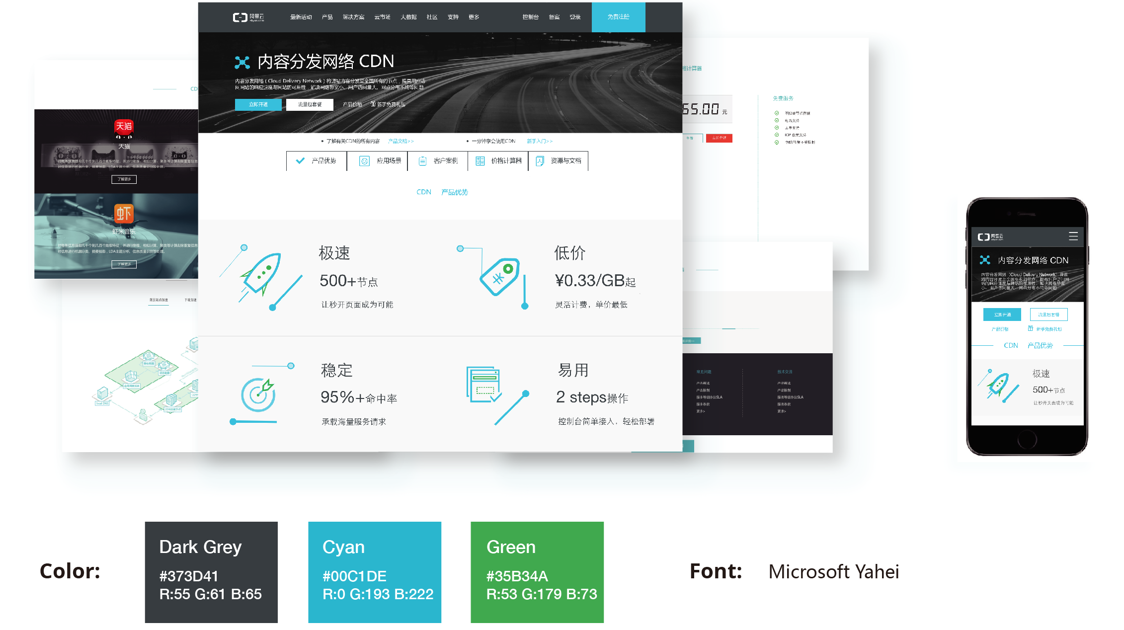
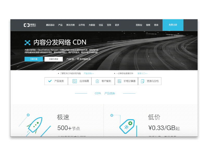
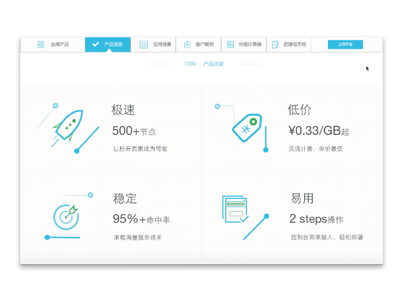
The new website of CDN was released after I finished my internship. As I looked at the new design, although I had know some part of the redesign plan, I still got shock by the good design and realized how much improvement space I had of my design skills. Generally speaking, CDN is a 2B product, but the final design has perfectly mixed several elements and features of 2C products, which is quite fit for marketing strategy here. So I learned that 2B products are not necessarily designed in a restrained and calm style, they can also has vivid and very confident slogan and visual style.

Be a crafter in UX design

My supervisor Yujing has influenced me a lot. He not only helped me improve my design abilities, but also made me think more deeply about design and my career. He once said, designers working on a real problem in a company sometimes could have been affected by some other aspects, such as the KPI requirement, the profit pursuit, or even competition between different departments. But when a designer is designing a product, he or she should, first of all, settle down, thinking completely from the user's need and experience and work as a crafter, getting rid of all the distractions and carefully polish every detail... These words touched me, and inspired me to explore the world of UX design. And I decided to be a crafter, crafting delightful experience with my maxium patience and attention in every design.